Demystifying Machine Learning
![]() Purpose/Introduction: This set of activities have been innovatively designed to teach machine learning in the science classroom. This can be used as part of the Predicting and Preventing Disease module or on its own in science courses. The machine learning skills applied here are used world-wide for health and biological research and have many applications in everyday life and the business world. This lesson will also deepen student understanding of the future of health research, first introduced through the wellness study in Lesson 2. The activities are designed to introduce key concepts one at a time for both teachers and students with wide ranges of experience in mathematics and computer science. Centering on a real-world phenomenon: “Why do young people have heart attacks?” students will learn hands-on how large amounts of health data can be analyzed. Using data from the Framingham heart health study they critically evaluate correlations that determine the focus of future healthcare research and disease prevention. Step-by-step students are guided as they use Excel or Google Sheets to identify correlated health features (age, body mass, smoking, etc.) and create visualizations of the data; they learn how to use Logistic Regression to train and test a mathematical model to make predictions about which risk factors are most closely linked to future heart disease. The lessons do not require previous computer science experience. More experienced students can mentor less experienced students, and broaden access to these lessons which integrate science, technology, math, and engineering practices to improve human health outcomes.
Purpose/Introduction: This set of activities have been innovatively designed to teach machine learning in the science classroom. This can be used as part of the Predicting and Preventing Disease module or on its own in science courses. The machine learning skills applied here are used world-wide for health and biological research and have many applications in everyday life and the business world. This lesson will also deepen student understanding of the future of health research, first introduced through the wellness study in Lesson 2. The activities are designed to introduce key concepts one at a time for both teachers and students with wide ranges of experience in mathematics and computer science. Centering on a real-world phenomenon: “Why do young people have heart attacks?” students will learn hands-on how large amounts of health data can be analyzed. Using data from the Framingham heart health study they critically evaluate correlations that determine the focus of future healthcare research and disease prevention. Step-by-step students are guided as they use Excel or Google Sheets to identify correlated health features (age, body mass, smoking, etc.) and create visualizations of the data; they learn how to use Logistic Regression to train and test a mathematical model to make predictions about which risk factors are most closely linked to future heart disease. The lessons do not require previous computer science experience. More experienced students can mentor less experienced students, and broaden access to these lessons which integrate science, technology, math, and engineering practices to improve human health outcomes.
- Objectives
- Overview
- Activity 2.2.1
- Activity 2.2.2
- Activity 2.2.3
- Assessment
- Career Connection
- Extensions
- Resources
- Accommodations
Objectives
COURSE: Any course in which students are exploring concepts related to individual, community or population health, factors that impact health, healthcare systems, or healthcare economics. Examples of courses where these lessons would align are: Systems Medicine, Biological Science, Ecology/Environmental Science, Family Life and Consumer Sciences, Health Education, Allied Health and Medicine Technical Education.
UNIT: Units where students are exploring systems, learning how to read and critically evaluate primary literature, develop digital skills and critically evaluate online sources of information, build empathy and develop health literacy. Additionally, units that focus on building 21st century skills, “soft skills”, problem solving, design thinking, systems thinking, career connections, career awareness, and career development skills are enhanced by using this module.
STANDARDS: See the Standards Addressed page for information about the published standards and process we use when aligning lessons with NGSS and other Science, Math, Literacy and 21st Century skills. Aligned Objectives are listed in buttons on the upper-left of this page and in the table below:
What students learn:
- to understand how correlation is determined in large population health studies
- to identify generalizable patterns that can be applied to finding a solution to a healthcare problem
- to know that predictions in health science are made by first finding correlations in large population health datasets
- to understand how machine learning is a powerful tool to help evaluate, compare and contrast variables in large population health studies
- to understand how logistical regression is used to further refine and visualize correlations in datasets
- to recognize how equity and access influence the data collected for a large health study, which affects future healthcare solutions
What students do:
- Explore & compare population health data from the Framingham Study
- Practice using excel data analysis and logistic regression tools
- Visualize and compare data using Excel and CIRCOS plots
- Evaluate the data in light of impact of equity, access, and influence on future healthcare outcomes
All three dimensions of the Next Generation Science Standards are addressed in this lesson. Please note that based on what part of the lesson you emphasize with students, you will cover different NGSS to different levels. Based on what is possible, we have listed here and in the buttons on the left the NGSS that integrate and emphasize this content.
| Aligned Next Generation Science Standards | |||||||||||||||||||||||
| By completing this Lesson, students will work towards meeting the following Performance Expectation(s). They will also be able to use and/or develop their understanding of the listed Science and Engineering practice(s), Disciplinary Core Idea(s) and Crosscutting Concept(s).
Performance expectation(s): HS-ETS1-1 Analyze a major global challenge to specify qualitative and quantitative criteria and constraints for solutions that account for societal needs and wants (Activity 2.2.1, 2.2.2); HS-ETS1-3 Evaluate a solution to a complex real-world problem based on prioritized criteria and trade-offs that account for a range of constraints, including cost, safety, reliability, and aesthetics as well as possible social, cultural, and environmental impacts (Activity 2.2.3)
|
|||||||||||||||||||||||
Overview
PACING GUIDE
This lesson consists of three multi-step activities, all of the activities can be completed in 6 x 50-min. class periods. In-class time can be reduced by flipping the classroom and assigning parts of the activities as homework. Extensions (adding more class time) to deepen understanding are also included to enhance the experience for students. It is also helpful, if students have completed Systems Medicine: Module 1, especially the lessons on making heat maps, and Module 2: Lesson 2 “P100 wellness study” about research using population data and the future of Predictive and Preventive health. For all of the activities Excel or Google Sheets versions of the spreadsheets are available for students, depending on your classroom needs.
ACTIVITY PACING GUIDE WITH ACTIVITY OVERVIEWS
Overview of Activity 2.2.1: How do you find Correlations? (3 x 50 min.)
To begin this activity, first evaluate and review the student’s computer and spreadsheet experience level using the Correlation Pre Assessment (10 min) and this practice activity: Student: (Google Sheet | Excel) and Teacher: (Google Sheet | Excel) (20-30 min.). The activity is a good introduction (or review) for the spreadsheet skills students will practice during the lessons. It can also be helpful for selecting teams for peer-to-peer support.
Why is the rate of Cardiovascular Disease growing in young people? How do we find future preventions and predictive health care? This lesson introduces how we look at large sets of health data, what machine learning is, and how useful it is for finding correlations that can lead to future healthcare innovations. Key concepts are introduced one at a time and students use step-by-step instructions for working in Excel or Google Sheets software to pre-process the features (or variables) in a subset of the Framingham health study data; then with a larger subset from the dataset students visualize and select the features with highest correlations to cardiovascular disease (CVD). In the final activity they will make a Circos plot to visualize their data in another way.
Overview of Activity 2.2.2: Predicting Health outcomes —Where does logistic regression take us? (2 x 50 min.)
Students learn how logistical regression calculations in machine learning are used to make predictions about the Cardiovascular disease risk, using the Framingham human health study population data. Starting with a smaller subset of the data they train a model, then test a larger dataset to identify the features that are predictive of Cardiovascular disease outcomes. Students analyze the Logistic Regression model outcomes, learn to adjust it to make the model more accurate. They are guided through a final analysis of the features the model predicted and the focus question: Why is the rate of Cardiovascular Disease growing in young people? A jigsaw explores the background of the Framingham human health study.
Overview of Activity 2.2.3: How can we use data to make predictions that lead to healthier outcomes? (1 x 50 min.)
Research using health datasets is a wonderful tool to help pinpoint the focus of further investigations that can lead to health treatments and preventions in the future. This lesson develops student awareness of the limitations of population longitudinal studies and expands understanding of some of the inequities of healthcare. They learn to question and consider bias inherent in population studies and consider obstacles and how to build inclusiveness.
ADVANCED PREPARATION / BEFORE CLASS
Documents, media, and dataset links for downloading are supplied at the start of each activity (2.2.1-2.2.3). (Have students download the spreadsheets and complete pre-assessment a day in advance of the lesson, if possible).
- Teacher & student internet access & online conferencing tools
-
- This lesson can be delivered in-person or remote, several online tools are used to analyze population health data and can be used to collaboratively share research results. Students and educators should have access to and familiarity with using the internet, and beginning level data processing in Microsoft Excel or Google spreadsheets. If you or your students do not have much experience with Excel or Sheets, we encourage you to first use this practice activity: Student: (Google Sheet | Excel) and Teacher: (Google Sheet | Excel) (20-30 min).
- Safety Protocols
-
- Students will be exploring and discussing many aspects of health including health outcomes of illness and death. These are sensitive topics that may be uncomfortable or emotional for students, especially when bringing in topics about health outcomes with real world human data. Thought and care should be given to the lived experiences of the students and in preparing students for these topics.
- If you are leading these activities remotely:
- The lesson includes use of breakout rooms for small group collaboration. Follow your district’s policies for using and managing breakout rooms with students.
- The lesson includes students sharing their screen to share their models and visualizations with the class. If screen sharing is not allowed, students can share a link to their data analysis models with you and you can share for them.
Activity 2.2.1
Predicting Health Outcomes: How do you find correlations? (3 x 50 min.)
Media and datasets Activity 2.2.1: (Choose Excel or Google sheets versions of the spreadsheets, depending on your classroom platform needs)
Before Class:
Post the student links in your school communication platform for them to download:
- Pre-assessment: Correlation Pre Assessment (Link and QR code also in presentation)
- Post-assessment: Correlation Post Assessment (Link and QR code also in presentation)
- Spreadsheet Practice Activity:
- Student: (Google Sheet | Excel)
- Teacher: (Google Sheet | Excel)
- Activity 2.2.1 Correlation
- Dataset Activity:
- Student: (Google Sheets | Excel)
- Teacher: (Google Sheets | Excel)
- Dataset Activity:
-
- Slide Presentation:
Print outs (or digital copy) (Print one per student):
- Activity 2.2.1 Correlation Steps for Activity: (Google Sheets | Excel)
- ML Excel / Sheets Cheat Sheet
- Features Key
- [Optional] Print out for teacher: (we highly recommend reading the full lesson plan and doing the activities prior to teaching)
- Article: Cardiovascular disease current research information
- Background: Correlation vs Causation Spurious Correlations
- Reading for homework: What is the difference between Machine Learning and Statistics?
Step 1: Assign the Correlation Pre Assessment (10 min) or scan QR code in (Slide 2) of presentation. (We recommend you assign this the day before you begin the lesson). Assign Spreadsheet Practice Activity Student: (Google Sheet | Excel) Teacher: (Google Sheet | Excel) (20-30 min.) The hands-on practice reviews the basic Excel / Sheets functions and skills needed for the Machine Learning activities to come. Use these to evaluate student skill and confidence to help form teams to provide peer-to-peer support during the activities.
Step 2: Start the Correlation Presentation (Slide 1) Introduction to Machine Learning. Begin a discussion by asking: “What are the indicators of healthy hearts? What do you know about heart health?” Call on several students to help compile a short list of their ideas about the disease – (possible answers: comparing healthy hearts to unhealthy ones – or “statistics” or “first hand observation”) Eventually focus students by asking: How do we know? Where does this heart health information come from? (answers may vary – statistics or risk scores). Where do these statistics/risk factors come from? (Yes, we can look at patient data to study the variations in a population so we learn about what may lead to heart disease. Studies to compare variables in populations are done using machine learning. So, what is machine learning?
Step 3 (Slide 2-3): Studying a whole population to determine patterns that lead to correlations about heart health – how is this done? Ask students: What do you know about this so far? (Where have we seen an example of this in our course? (Lesson 2.1 – the P100 wellness study.) This is also similar to something you may have worked with in a statistics class, or learned about before. But it is not the same – Ask: What are the differences between machine learning and statistics? While both statistics and machine learning involve creating models based on data, machine learning models emphasize prediction while statistical models focus on estimation and inference (a conclusion based on evidence and reasoning). Statistical concepts are commonly used in machine learning, but machine learning practitioners are free from model assumptions that statisticians have to grapple with (like what is the distribution of the population we are collecting data from). In other words, as long as the machine learning model can make good predictions, they can use any techniques they want to develop their model, whereas the statistical models are heavily reliant on the type of data they’re concerned with, and are not necessarily used to make predictions (or at least accurate ones).
| Extension: Assign two articles that will help students learn more about the differences between statistics and machine learning. |
Step 4: (Slide 4) Have students offer ideas: What are the similarities and differences of machine learning and artificial intelligence? Machine learning and artificial intelligence often appear in the same context, so it is easy to confuse the two as the same thing. However, while their applications definitely overlap, there are key differences that we must note. Machine learning is considered to be a subset of artificial intelligence. Artificial intelligence (AI) is the ability of a computer/other machine to mimic human activity and thinking (i.e. a chatbot that mimics human conversation and emotions). Computers use machine learning algorithms, mathematical concepts, and logic to help computers complete tasks and problem solve like humans would. Machine learning is the means by which AI gets its intelligence. Although artificial intelligence is one crucial application of machine learning, let’s think of examples of machine learning as it is utilized, and in many instances outside of artificial intelligence. The activities we are about to do would not be classified as artificial intelligence because it is not mimicking human activity.
Step 5: (Slide 5) What does machine learning do? Ask students for their own ideas – then summarize [describe using the text on the slide] Inputs data (of many types eg. language, time series data) (–> a machine learning model is designed for different types of problems –> trained to learn the data through a series of testing of subsamples of data –> Outputs (predictions, songs, forecasts)
Step 6: (Slide 6-14) In what everyday scenarios can machine learning be used? Have students name scenarios where they think machine learning might be applied and write them on the overhead. Offer more examples — pick and choose what applies to the class from slides 6-14.
Step 7: (Slide 15) In medical settings, machine learning is used to enhance personalized, precision medicine: predicting what treatment protocols are likely to succeed on a patient based on various patient attributes and the treatment context; as well as diagnosing a patient.
Example: Sevda Molani, PhD – who helped develop these lessons – uses machine learning to research populations affected by inflammatory diseases such as multiple sclerosis, looking at not only genetics, but also longitudinal patterns in both phenotype (clinical observations and patient reported outcomes) and exposures (such as medications, infectious disease and health-related social needs).
Machine learning (specifically, neural networks/deep learning) is also used to classify tumors as malignant or benign and/or classify images in oncology or even forecasting flu strain prevalence during pandemics. Additionally, natural language processing algorithms can be used to transcribe conversations between doctors and patients or analyze clinical notes.
Step 8: (Slide 16) Introduces the phenomenon: Ask: “What is the number one disease with highest cause of death in the population of the United States?” Students will have various answers, but heart attacks have been and remain the number one cause of death in the United States (CDC 2022). “Cardiovascular disease – like heart attacks and stroke – may seem like an elderly disease. But studies have shown that cardiovascular events are happening more and more frequently in people as young as 20.” Briefly introduce the increase in cardiovascular events in younger people.
TEACHER NOTE: Do not get into too much detail on heart disease, at this point in the lesson — there will be time at the end of the module to compare student predictions from the model they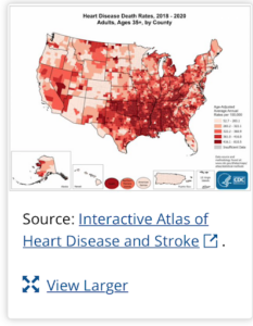 build and current CDC information on heart disease. After they have made their own predictions using machine learning – students may then want to examine this CDC interactive map of heart disease. build and current CDC information on heart disease. After they have made their own predictions using machine learning – students may then want to examine this CDC interactive map of heart disease.
BACKGROUND FOR TEACHERS: More heart attacks are occurring in very young adults in the U.S Even though fewer heart attacks are occurring in the U.S., these events are steadily rising in very young adults. New data not only validate this trend but also reveal that more heart attacks are striking those under age 40, according to research presented Mar 07, 2019. “It used to be incredibly rare to see anyone under age 40 come in with a heart attack—and some of these people are now in their 20s and early 30s,” said Ron Blankstein, MD, a preventive cardiologist at Brigham and Women’s Hospital, associate professor at Harvard Medical School in Boston and the study’s senior author. The research is the first to compare young (41-50 years old) to very young (40 or younger) heart attack survivors, and found that:
Source: Heart Attacks Increasingly Common in Young Adults – American College of Cardiology |
In table teams of 4, ask students to:
- Reflect:
- What do you notice or wonder about? What do you think might be some risk factors for cardiovascular disease? Why do you think the disease might be trending younger?
- “What are the indicators of healthy hearts?” And what steps can researchers and doctors take to monitor and improve the health status of our cardiovascular system?
Ask students for input. Discuss – write their ideas on the board. Share with the class. (Use Jamboard if online).
| Extension: For more detail assign “CVD Incidence increase” information |
Step 9: (Slide 17) Observe two circos plots of correlations — on the left is a familiar one from the P100 wellness study, 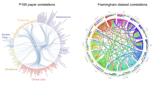 the other is a small subset of data from the Framingham heart health study. As students learned from exploring the P100 wellness study, in Lesson 2.1, finding correlations in large sets of data can lead to future predictions about what may cause diseases, and how to find common risk factors among a population. The P100 wellness study laid out several interesting correlations between variables. In this lesson, students will be using machine learning to find correlations in a subset of the heart health study dataset. Finding correlations in a large set of data, such as this, can lead to future predictions about what may cause heart disease in young people.
Step 10: (Slide 18-19) So what is Correlation vs Causation? Use a phenomenon about the increase in ice cream and air conditioner sales to review correlations. Ask: From this phenomenon what can you conclude? Is the relationship between ice cream cones and air conditioners a correlation or causation? Remind them, that just because they are correlated does not mean that one variable causes an outcome.
Step 11: (Slide 20) Next, review the three main types of correlations, asking students to identify and name: positive, 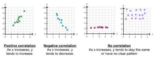 negative, and neutral. They may also find nonlinear correlations in datasets – this concept comes up in greater depth later in the activity.
- Assess student understanding of “correlation”
- Summarize: Correlations are used to understand the data and its patterns: further research is needed to determine causation.
| Extension: If additional conversation about correlation vs. causation is needed, look through this website: Spurious Correlations. |
Step 12: (Slide 21) Return to the phenomenon, ““What are the indicators of healthy hearts?”
Present overview of activity: In today’s activity we are going to explore how correlations are calculated and how to interpret the outcomes of those calculations. Our goal is to identify correlations across variables using the Framingham dataset – a human health study done over many years (a longitudinal study). To see if there are real world correlations that are repeated in populations. We will determine whether there is a correlation between different features and between features and CVD outcome.
Ask, “Why would we want to do this?” (Use their responses to this question to formatively assess the learning so far.) These correlations will help us in formulating a hypothesis about what variables have the greatest influence on cardiovascular disease and selecting features that will be used to predict health outcomes.
We will be doing these activities in Excel or Google Sheets using a calculator written for you, embedded in the sheet. But in the real world, scientists would do the calculations using languages like Python and R. These languages are designed for statistical analyses and have add-ons (packages) that allow you to quickly create correlation matrices and run logistic regression on your data.
(Slide 22) Remind students that Variables and Features are the same thing – and will be used interchangeably.
Step 13: (Slide 23) Before diving in, more about the “Framingham Heart Health Study” dataset. Familiarize students briefly with the key points of the study, and why it was first undertaken.
Teacher Background Information on the Framingham Heart Study
(Please note, the students will be learning this throughout the lesson, so please do not share all of this with students at the beginning of the lesson. Only share the part that is included in the slideshow.)
By the early 1920s, diseases of the heart consistently ranked as the #1 cause of death in the United States. Even the President was not immune to this emerging health concern: Franklin Delano Roosevelt died of hemorrhagic stroke in 1945 due to uncontrolled hypertension, raising awareness about the rising toll of cardiovascular disease. Driven by the need to understand this growing threat, the Framingham Heart Study (“Framingham”) was started in 1948 by the U.S. Public Health Service, now the National Heart, Lung and Blood Institute [NHLBI]) of the National Institutes of Health [NIH]). One of the first long-term cohort studies of its kind.
The study has not only contributed enormously to our understanding of the natural history of cardiovascular disease and stroke, it also enabled us to identify their major causal risk factors. We now go beyond treating disease once it occurs by emphasizing disease prevention and addressing modifiable risk factors.
- The dataset you will be working with came from this long epidemiological study of a population from the town of Framingham, MA.
- You will use a subset of the Framingham study data which includes laboratory, clinic, questionnaire, and health event data on 4,434 participants. Data was collected during three examination periods, approximately 6 years apart, from roughly 1956 to 1968. Each participant was followed for a total of 24 years to see if there were any of these CVD outcomes: Angina Pectoris, Myocardial Infarction, Atherothrombotic Infarction or Cerebral Hemorrhage (Stroke) or death.
- The town was picked because it was big enough to provide a sufficient number of individuals for the study, while also being small enough to use a community approach for recruiting participants.
- Participants came from a range of ages, both male and female.
- The study has expanded geographically and in population scope and continues up until today.
Step 14: (Slide 24) So, How can machine learning be used to accurately predict a patient’s risk of developing CVD?
Set the stage. Ask students to “imagine we are in the 1950s…we don’t know the answers, and heart disease is one of the leading causes of death.” Ask: What do we need to do to uncover how age is a factor? (Students may offer that we first need to ask: What factors contribute to the risk for developing Cardiovascular Disease (CVD)? So, to do this you will identify correlations, then, learn to use Logistic Regression to test predictions about the risk factors for Cardiovascular Disease. At the end we will look at these questions:
- How do our own findings compare to the Framingham Heart Study findings?
- What did we learn about why young people are at increasing risk for heart disease?
If not done already, assign Spreadsheet Practice Activity: Student: (Google Sheet | Excel) Teacher: (Google Sheet | Excel) – This is a good basic review of Excel / Sheets functions and skills needed for all of the Machine Learning activities to come. Use this to evaluate student’s skills to form teams to provide peer-to-peer support during all of the activities.
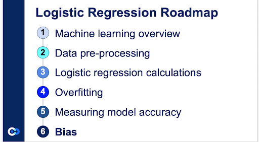
Step 15: (Slide 25) Students are about to practice the process of calculating correlations and interpreting the data related to CVD, using the steps in the Correlation Roadmap. The first two steps in orange are known as pre-processing steps. Hand out the Correlation Steps for Activity: (Google Sheets | Excel) This will guide them after you have presented each of the activities in the Roadmap using the slides. Remind them to STOP at the points indicated in the ‘Steps’ guide for further information and instructions.
Summary of the activities for Correlation: (Have students download and make a copy of the spreadsheets a day in advance of the lesson). Each student will work on their own copy. If your school uses Office 365, you should have students open Excel on their local drive. They will be saving their file in an alternative format in Activity 2d (Make a Circos Plot) and that is only allowable on the local drive. Open the file: Correlation Dataset Activity Student: (Google Sheets | Excel) This dataset is a subset of the Framingham health study data, prepared for the activities.
Show how the pre-processing steps are the first two activities listed in their Correlation Steps for Activity: (Google Sheets | Excel). The first activities (1a-1e) use a small dataset, a subset of the Framingham health data.
Follow the ‘Correlation’ slide presentation to introduce each concept, allowing students to practice and learn how to do these steps themselves, in their own copy of the spreadsheet. Go one activity at a time, pausing to help students as they work. Do not let students jump ahead, and although they will be practicing skills, they will miss the reasoning behind each phase in the process of finding correlations.
Step 16: Introduce the variables in the dataset. Show students the dataset on screen: Correlation Dataset Activity Teacher: (Google Sheets | Excel). Ask: Which variables intuitively do and some that intuitively don’t have correlations? Use the Features Key (handout) to observe and discuss what the feature names mean. The correlations identified in the dataset will help to predict which features have the greatest influence on cardiovascular disease as a health outcome. We will determine whether there is a correlation between feature to features and feature to outcome (which is a higher health risk for Cardiovascular Disease (CVD)).
Step 17: As a class, make a guess as to which features will be the most correlated to the outcome of heart disease (CVD)? Ask students in table teams to:
- Hypothesize whether the variables are correlated or not.
- Rank the next top 3 features that seem most correlated with CVD. (Top 3 variables that intuitively do and some that intuitively don’t have correlations to CVD?)
- Share out hypotheses and rationales as a whole class.
- Discuss: “How can better correlations be calculated?”
Understanding will grow as they go through the process.
| More teacher background on CVD: Cardiovascular Disease or CVD in the Framingham study (2014) is defined as: “Incident Hosp MI or Stroke, Fatal or Non” which means within the period of the study the individual has an incident or symptoms of: Myocardial infarction (Hospitalized), Fatal Coronary Heart Disease, Atherothrombotic infarction, Cerebral Embolism, Intracerebral Hemorrhage, Subarachnoid Hemorrhage or Fatal Cerebrovascular Disease. |
Step 18: Assign students to working groups of 2-3 students. Each team is going to approach these activities at a different pace – form groups of 2 to facilitate these hands-on portions:
- Combine students who are more familiar with (using Excel/Google sheets) and those with less experience, who might benefit from peer support. MANY students may have limited experience with spreadsheets, pairing them for peer support with basic tasks and shortcuts allows them to focus on learning the processes behind machine learning.
Step 19: (Slide 26) Before students can calculate the correlation between features and visualize the data, they will perform pre-processing of the Correlation Dataset Activity Student: (Google Sheets | Excel) starting at tab “1a_Variables.” [At this point, begin to introduce each concept using the slides and then ask them to practice these skills, used in machine learning to improve accuracy when an algorithm is applied to a dataset.] Correlation Dataset Activity Teacher: (Google Sheets | Excel)
There are two different types of variables used in the dataset: one is a continuous variable and the other is a discrete variable. (Note: For other datasets categorical variables are also possible. [eg. sex is a categorical variable in the study – and since the program does not recognize anything but numbers, the male and female variables are represented as 0 or 1.])
Step 20: (Slide 27) Your turn. Direct them to go to the 1a_Variables tab in their spreadsheets. Are the variables continuous or discrete? Ask them to identify the type of variable, in each column, using the labels from the drop down in row 12. Direct them to the Correlation Steps for Activity: (Google Sheets | Excel) which walks them through these steps; it includes a glossary for terms that will become familiar as they work. Have them follow the instructions in the “Steps” guide carefully and in order—circulate to offer help and check progress.
Step 21: (Slides 29-30) Next, STOP their work and introduce the next preprocessing step in the Road Map: Address “null variables” and “outliers”. Those cells that are empty or missing data are called null variables and need to be addressed as they will impact our calculations. Ask students: Why might we have null data? How might we fix this issue? To remove null values: Find a null variable and then practice using Excel or Google sheets to calculate the mean (average) for each column and replace the empty “null” cell in the column with this new mean and underline it.
(Slide 31) Direct students to the “1b_Null_Values” tab and the Correlation Steps for Activity: (Google Sheets | Excel) to continue preparing the raw data.
Step 22: (Slides 32-34) So how do you find an outlier? A graph showing outliers helps conceptualize how ‘outliers’ can influence a dataset to make it less accurate. Students may have used a graph called a box and whisker plot – visually showing quantitative data and its spread.
(Slide 35) explains how to remove the outliers using a mathematical calculation in Excel or Sheets, that will keep the trend within the upper and lower boundaries of the ‘best fit line’ of the data. The box shows the 25th, 50th, and 75th percentiles of the data, defining the boundaries of the dataset, while the whiskers show the spread of the data. The distance from the 25th to 75th percentile is called the interquartile range (IQR). An outlier is any value above =Q3 + (1.5 * IQR) or below =Q1 – (1.5 * IQR).
Step 23: (Slide 36) Your Turn. Direct students to go to 1c_Outliers in their spreadsheets and to the Correlation Steps for Activity: (Google Sheets | Excel). Check student work as you circulate.
Once this final pre-processing step is complete, students will be ready to calculate and then analyze the correlations.
Step 24: (Slides 37-38) Okay, so now we know how to pre-process our data. We can also eyeball correlations to see their general pattern. But how do we quantify our correlations? In data science, we can use Pearson’s correlation coefficient (also known as an r-value). This measures how closely two sequences of numbers resemble each other.
Step 25: (Slide 39) Before we do the calculations ourselves, let’s quickly talk about how to read a correlation matrix. When reading correlation matrices, each row and column corresponds to a variable. The r-value is a number between -1 and 1. It tells us whether two columns are positively correlated, not correlated, or negatively correlated. The closer to 1, the stronger the positive correlation. For example, a variable will correlate perfectly with itself so it will have a 1. The closer to -1, the stronger the negative correlation (i.e., the more “opposite” the columns are). The closer to 0, the weaker the correlation.
Remember we are first seeing what things are correlated in order to suggest things like cause and effect. Are there correlations in the small dataset that immediately make sense to you?
(Skip to Step 26 unless teaching high level math): (Slide 40-43) Calculating Pearson’s Coefficient: Introduce the mathematical concept behind the calculation – there is no need for students to memorize or use the formulas – only to absorb the reasoning behind it when it is applied. Sigmoid function: The machine calculates a probability for each patient (Example: patient #1 is 44% likely to have diabetes in the next 10 years and 56% she is not). After creating this probability the Sigmoid function algorithm makes a final decision about which value (Diabetes or no Diabetes) to pass as output and what not to pass as output.
Teacher Background: Correlation Explained Visually. A geometrical approach to Pearson… | by Samuele Mazzanti | Towards Data Science
Step 26: (Slide 44) This animation is using Pearson’s coefficient to calculate the data points in relationship to each other. As the r coefficient changes notice the relationship of the dataset to the best fit line, and the slope of the line. Is it a high or low (more distant) correlation? Ask students: At Pearson’s correlation coefficient r = 1 – what is the relationship of the dataset to the line? Correlation higher or lower? At r = 0.813 – what is the relationship of the dataset to the line? When r = 0 – what is the relationship of the dataset to the line?
(Slide 45) As the r-coefficient changes notice the relationship of the dataset to the line, and the slope of the line. Take an educated guess as to the r coefficient value for each of these. [Click through the animation in this slide – to reveal the r values as you describe/name each example 1-4.]
- Large Positive ? At r = 1 – describe the relationship of the dataset to the line.
- Medium Positive? At r = 0.7 – describe the relationship of the dataset to the line.
- Small Negative Correlation? At r = -0.46- describe the relationship of the dataset to the line.
- Weak or no Correlation? When r = 0 – describe the relationship of the dataset to the line.
In general the coefficient is lower (closer to zero) if the correlation is lower. And the highest correlation coefficient is 1 – which is something correlated with itself. The r-value is a number between -1 and 1. It tells us whether two columns are positively correlated, not correlated, or negatively correlated. The closer to 1, the stronger the positive correlation. The closer to -1, the stronger the negative correlation. The closer to 0, the weaker the correlation.
Step 27: (Slide 46) Your Turn. Direct students to the 1d_Correlation Types tab and the Correlation Steps for Activity: (Google Sheets | Excel) to compare features and assess correlation between different features by creating scatter plots. Here we will just look at two features – A and B – as you may have done in a math or statistics class. Demonstrate first using the ‘Steps’ guide then have students create two different scatterplots: one between SEX and SYSBP and one between SYSBP and DIABP. If students finish their scatterplots quickly, invite them to look for correlation types between any other two features. What do you notice about these two scatter plots?
Step 28: (Slide 47) Analyzing the scatter plot correlations. In the first scatter plot we can see that SYSBP is a continuous variable but SEX is discrete so points are going to appear anywhere along the SYSBP however SEX is either 0 for female or 1 for male. What is the correlation? (The correlation is pretty low, you are going to get a pretty low positive correlation – with female patients. Right now we are not asking students to calculate the statistic – even if you measure how much there is – it is going to be a low number.) In the second scatter plot we can see that SYSBP is a continuous variable and so is DIABP (diastolic blood pressure). What is the correlation? Ask students – Does it make sense that these two blood pressure measurements would have a correlation? As one increases due to pulse pressure on the arteries, as the heart pumps, the other would also increase. There is a linear relationship from pulse pressure – so likewise both will decrease. With some exceptions due to arterial hardening – the correlation between these features is positive. For this activity, we’ll just use Pearson’s correlation coefficient for everything – there will be a small amount of error because of this, but nothing that will significantly impact our results.
Did anybody make a scatter plot of a different correlation pair? (Discuss if they discovered any correlations between two features, and if so was it negative or positive? Reason out what that means from the data)
How can we look at more than two features at a time? Remind students that searching for correlations using scatter plots works well between two features – But, finding correlations among many features gets challenging to do in a scatter plot — This is where using Machine Learning assists in looking at features altogether and comparing.
Step 29: (Slide 48) Direct students to the 1e_Calculations & Visualization tab and Correlation Steps for Activity: (Google Sheets | Excel) to understand how to calculate the Pearson’s correlation coefficients using Excel/Sheets to create their own tables. Ask students: What do you notice about the correlations between features now? We can make it easier to see the correlations. Next step is visualization.
Step 30: (Slides 49-50) 1e_Visualize your Data. One way to better see our correlations is by creating a heat map. Students have made scatter plots first, to understand the correlations but – there is a lot of information on correlation matrices. If you have a larger table, you will not be able to recall and read all those numbers – so scientists apply various forms of visualization tools to make the correlations easier to make sense of. In this case color is used to color the values to see correlation through shades of color associated with the Pearson’s correlation coefficient. We will be using the Conditional Formatting feature to make a heat map like this.
Step 31: (Slide 51) Direct students to the 1e_Calculations & Visualization tab and Correlation Steps for Activity: (Google Sheets | Excel) to add heatmap color to their table using conditional formatting.
Step 32: (Slide 52) When students complete the exercise: 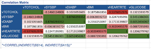 Students see that, when creating heat maps, there are several groups of correlation values ranging from insignificant(not correlated) to significant (highly correlated). The ranges of these groups are based on general scientific knowledge. In the real world, scientists would also have to do additional calculations to determine the probabilistic significance of the correlations – but for simplicity, students just use these ranges for now.
Step 33: (Slide 53-54) Bias, Errors and/or Pitfalls One thing to keep in mind is that we’ve only used a sample of the full Framingham dataset to create our correlation matrix. This might lead to sampling error: a correlation that we’ve found in the small sample sets we’ve been working with might not apply across the entire dataset. For example, if in our sample data, everyone in the first 10 rows were 65+, but there were a mix of ages in the rest of the dataset (the part that we aren’t looking at), we might not accurately calculate correlations between age and other variables for the broader population.
Unless you’re studying the entire population, there’s always going to be some bias: but when you increase the size of your sample dataset, you can minimize that bias significantly. That’s why we’re going to apply what we’ve learned to an even larger version of the Framingham dataset.
After completing the Small Dataset activities, lead the whole class in a short discussion.
- Remind them the dataset used in this first activity is very small, so the correlations identified may challenge what is known about other health correlations.
- Ask students and discuss: “How can better correlations be calculated?” Acknowledge that using larger datasets will be the next step.
Step 34: (Slide 55) Let’s apply what we’ve learned to an even larger dataset. Remember- The Framingham study has thousands of data points, so we’re only going to be looking at the first 250 rows. This is large enough to reduce sampling error significantly, but small enough to still run on Google Sheets. In the real world, a scientist might use many more rows in the dataset because they have more processing power with their equipment.
In the next part of this activity students develop understanding of and practice the skills to find correlations in the data using the Large Dataset. Can we use what we learned from the initial exploration of the data, to make any assumptions about the variables in the Framingham data we will choose to explore and evaluate next? The pre-processing steps (outliers and null variables) were completed for students in this Large Dataset, students will use tabs 2b-2d to calculate and then analyze the correlations.
First, ask students to examine the data in the “2a_Large Dataset” tab. What do you notice?
Step 35: (Slide 56) Your Turn. Direct students to 2b_Calculations & Visualizations and to the Correlation Steps for Activity: (Google Sheets | Excel) Because of the greater amount of data, we can use machine learning to assist this process. Pearson’s coefficient is again applied to this Large dataset to calculate the correlations among all of the features. Follow the steps in the guide to use the =CORREL function again.
(Shortcut to save you time) Instead of typing this same formula into each cell individually – copy and paste the CORREL function into all of the cells in the table (the ‘INDIRECT’ part of the function automatically grabs appropriate columns and rows). Highlight the whole table – then use “paste special” to copy the formula in the first cell across the whole table. Check the results to see that you have ‘ 1 ’ in all of the “correlations with themselves” [eg. RANDID to RANDID] cells.
When complete – Ask students:
- What variables were the most and least correlated? Does this make sense?
- Were there any correlations that surprised you? Why or why not?
Step 36: (Slide 57) When students are done, remind students: What we want to look at is correlations between different variables, as well as between variables and our CVD outcome. What is “CVD Outcome”? Remind students that the study is looking at how many people were diagnosed with heart disease or developed symptoms during the study (CVD), and what were the health variables that might correlate to that.
Step 37: (Slide 58-61) So What? Choosing is the most important part of the whole process of finding correlations – and requires students to evaluate the correlation in relation to each other, and to the outcome of Cardiovascular Disease (CVD). The correlation matrix allows us to see what information we should feed to our algorithm, and what information we should eliminate to prevent bias or error. This process is called feature selection.
Ask Students: Does anyone have any hypotheses for what data we should eliminate based on our heatmap? Let students give ideas as a whole group. Yes, we’ll first start by eliminating variables that have no correlation to our outcome.
(Slide 62) But there’s another step to feature selection. There are two types of correlations in our matrix: correlations between two features—like between glucose levels and diabetes—and correlations between a feature and our outcome of cardiovascular disease (CVD). If we want to predict our outcome, would we want to use features that are closely or not closely correlated with the outcome? Have students share their thoughts and explain their reasoning.
Because correlations show relationships between two variables, we would want to maximize the correlations between a feature and our outcome. But what about correlations between features? When we have a very high correlation between features, that actually skews our analysis.
Step 38: (Slide 62-64) This Venn diagram, the weight vs BMI, and the heatmap examples illustrate to students why this is an important selection process and how to find them.
(Slide 62) If we look at which variable has a stronger correlation with our outcome, students should find that it’s Feature 2. For this reason, we remove the values from the variable with the lower correlation to the outcome (Feature 1).
(Slide 63) imagine we were measuring two variables: weight and BMI. These two variables are highly correlated (as weight impacts BMI). If we put both of them into our algorithm, the algorithm would double count weight – it would think that weight is actually twice as important as it actually is – and we would get inaccurate results. We want each variable we add to the algorithm to provide new information. To do so, we want to minimize the correlation between features.
(Slide 64) So, how do we both minimize correlations between features and maximize correlations between features and our outcome? First, we look at our heatmap. If any features have a correlation greater than 0.7 or less than -0.7, we need to look at how highly those variables are correlated with our outcome of CVD. Then, we remove the one with the lower correlation to the outcome (between -0.01 and 0.01) so we can maximize our model’s predictivity.
Step 39: (Slide 65-67) Demonstrate the ranking matrix and how to eliminate correlations that are not highly correlated or that are too highly correlated. Examples: how do we both minimize correlations between features and maximize correlations between features and our outcome? What if the feature does not have any correlation? Eliminate these feature values as well.
Step 40: (Slide 68) Your turn. Direct students to 2b_Calculations & Visualizations and to the Correlation Steps for Activity: (Google Sheets | Excel). Have students use the heatmap feature to identify and write down features correlated with each other (feature to feature) and features that are not correlated with CVD (feature to outcome).
Step 41: (Slide 69) Now students will take the features they identified and eliminate them from the dataset. To do this in the spreadsheet highlight the values in the cells and click “delete”. By eliminating the values for the other feature, the extra weight of two features that are very highly correlated is reduced.
Step 42: (Slide 70) Your turn. Direct students to 2c_Feature Selection and to the Correlation Steps for Activity: (Google Sheets | Excel). Discuss: What do you notice …? What do you wonder…? What can we learn about…? Before they move on to creating models, and making predictions – follow the steps to making a Circos plot of the correlation. Circos plots are unique visualizations of the data that can reveal the many correlations and relationships between all the features in one image. Download your Sheets as a tab-delimited (.TSV) or Excel as a (.CSV or .TST) file.
- Please note, if using Excel, students must open Excel on their local drive and not through Office 365. Office 365 does not allow the file to be saved in an alternative format, which is needed to run this visualization.
- Ultimately, they will Upload their file to this link: http://mkweb.bcgsc.ca/tableviewer/. After they upload their file, no buttons need to be selected after uploading their file (many students will ask). Also, the “upload” button may stay grayed out after choosing your file, making it seem like it doesn’t work, but it does. You just have to click and wait.
The correlations found here in their Correlation Matrix will be used in the next Activity 2.2.2. to make predictions using Logistic Regression.
Step 43: (Slide 71) Once students have created their visualizations, discuss the class results. Ask students to share why one visualization is different from the other, what it might be useful for, and the way they created the visualization.
- What do the connecting wavy lines mean?
- How are the correlations grouped around the outer circle?
- As a class have students share their thoughts from the breakout or partner groups
Step 44: (Slide 72) “What are the indicators of healthy hearts?” As a class reevaluate how we would rank the correlations now after performing feature selection. Did their rankings change from when they ranked their first correlation hypotheses at the start, using the small dataset?
- Did your correlation rankings change?
- Why did your correlation rankings change?
- What may have influenced those changes?
Step 45: (Slide 73-74) Now we have done this. What is next? We’ll be using the features we’ve selected to analyze the data further, by creating a model using logistic regression to test a larger dataset that will help predict a patient’s likelihood of getting CVD. [the Outcome]
Understanding will grow as they go through the process:
- Repeat the idea to focus on: If you were to create a health plan to maximize cardio-vascular disease(CVD) prevention for young people, what features, variables would you want to consider?
- Remind them this information could then be used to:
- Conduct research to identify causation. A Randomized Control Trial (RCT) is the best way but, trials are expensive and take a long time to identify direct relationships; so the first step is finding and prioritizing which correlations to test
- Use correlations to analyze clinical results to predict outcomes for a new patient to inform their potential changes to lifestyle and behavior. This will be explored further in Systems Medicine Module 2, Lesson 7 on personal health behavior planning.
Step 46: (Slide 75) Assign the Correlation Post Assessment at the end of the lesson or have students scan the QR code.
End of ‘Correlations Matrices’ Activity 2.2.1. Next, Activity 2.2.2 will have students making accurate predictions using Logistic Regression to create and test data using a mathematical model.
Activity 2.2.2
Predicting Health Outcomes: Where does logistic regression take us? (2x 50 min)
Media and dataset links Activity 2.2.2: (Choose Excel or Google sheets versions of the spreadsheets, depending on your classroom platform needs)
Before Class:
Post the student links in your school communication platform for them to download:
- Pre assessment: Logistic Regression Pre Assessment (Link and QR code also in presentation)
- Activity 2.2.2 Logistic Regression
- Dataset Activity:
- Student: (Google Sheet | Excel)
- Teacher: (Google Sheet | Excel)
- Dataset Activity:
-
- Slide Presentation (2.2.2 and 2.2.3):
Print outs (or digital copy) Activity 2.2.2:
- Activity 2.2.2 Logistic Regression Steps for Activity: (Google Sheets and Excel)
- [Optional] Print out for teacher: (we highly recommend reading the full lesson plan and doing the activities prior to teaching)
- Article and Jigsaw: Framingham Study Background and questions
Step 1: (Slides 1-2) Open the Logistic Regression Presentation presentation. How can machine learning be used to accurately predict a patient’s risk of developing CVD? After finding correlations among different features in the first Activity 2.2.1, we will now use the same Framingham data and features to make accurate predictions by matching these patterns to known outcomes for CVD. We have selected our features, and the next step of this process in Activity 2.2.2 is to create a model which will help us to classify patients as likely or unlikely to develop CVD, using a mathematical algorithm. Assign the Logistic Regression Pre Assessment (10 min) or scan QR code in (Slide 2) of presentation. (We recommend you assign this the day before you begin the lesson).
Step 2: (Slide 3) Introduce the process and the skills students will use in the activity.
- First we will use a small dataset (from the Framingham data) to learn how to pre-process the data by scaling it.
- Then we will train a mathematical model by applying the algorithm to a large subset (700 patients) of the Framingham dataset.
- Next we test the model with a smaller subset (300 patients) of the same dataset.
- We will also learn how overfitting requires that the model is adjusted to refine its accuracy.
- And then learn to adjust the accuracy, precision, and recall of the model by changing the threshold.
- Recognizing and understanding bias in studies using large datasets is an important part of using machine learning to make predictions. Our new model will be explored and evaluated through this lens in Activity 2.2.3.
Before we get into the process of creating a model, let’s take a step back and talk about machine learning as a concept.
Step 3: (Slide 4-6) Machine learning models generally fall into two categories: Supervised learning describes models where we know the eventual outcome. For example, in the Framingham dataset we know from patient examination records whether patients have cardiovascular disease or not, and we can use that information to predict a new patients’ risk of getting the disease. We can also see what features have the greatest impact on their risk of getting the disease. This method of prediction is used for anything from the price of a house to the health outcomes of a patient. On the other hand, Unsupervised learning describes models that do not have labeled data, meaning that their organization is up to human interpretation.
| (Optional: Slide 7) Extension: To reinforce the concept of machine learning, have students play the card sorting activity with Instructions Machine Learning Card sort using Canva images (or printed cards) Students learn hands-on the difference between supervised and unsupervised learning. |
Step 4: (Slide 8) Download, copy, rename and save the Logistic Regression Dataset Activity Student: (Google Sheet | Excel) Teacher: (Google Sheet | Excel) (This is a subset of the Framingham dataset developed specifically for use teaching the Logistic Regression part of the lessons. The google sheets and excel spreadsheets contain slight differences in their algorithms due to differences in the software, be sure students are using the corresponding software.)
Before students can make predictions using the features they will again perform pre-processing of a small dataset. Hand out or have students download the Logistic Regression Steps for Activity: (Google Sheets and Excel) which provides step-by-step instructions to learn these skills. They will be directed to use these later in the activity.
Step 5: (Slide 9-11) Scaling the data. Scaling in machine learning is the process of rescaling data into the range [0 to 1] or [-1 to 1]. Rescaling and other types of normalization change the coordinate system so that all variables lie within a similar range. Think about how a scale model of a building has the same proportions as the original, just smaller. That’s why we say it is drawn to scale. The range is often set at 0 to 1.
Step 6: (Slide 12) Your turn. Direct students to go to the “1_Scaling” tab and follow the instructions in the Logistic Regression Steps for Activity: (Google Sheets and Excel) guide.
Step 7: (Slide 13) Students will first learn the mathematical concepts behind the calculations, and then the skills to carry out the process. They will begin to work with the large dataset to learn how to train and test a model to make predictions.
Step 8: (Slide 14-15) Introduce logistic regression as images to explain the larger big picture ideas in relation to the Framingham data.
(Slide 16-17) Explain how linear regression translates to logistic regression when working with multiple data points. Explain each variable of the equation and how it relates to the “best fit” line (details in the slides).
Step 9: (Slide 18-23) Music selection review activity. To illustrate this a Music Selection program, as an example, is helpful and relatable – (Spotify or Pandora are great examples).
(Slide 18): Ask students to observe the features in the data set. Ask: how would you classify a song as highly popular or having a high score? What values do you think influence the song classification the most?
(Slide 19): Ask them to look at the data. Can you pick out a song that fits your own popular listening choices? What features with high values does it have? If you were looking at this dataset and the values assigned to each feature of the songs – how would you classify their popularity? What do you think influences a song’s final classification – or scores it as “Popular” versus “Not Popular”? What is the range of the rescaled data?
(Slide 20-21): To demonstrate how algorithms in machine learning calculate this, students use the weights for the 13 features to calculate the score for a song. The score in this case reflects where the song ranks among all the song features. [Score = weight * feature value ]
(Slide 22): What is the resulting score? How do we compare this to other songs? What is the meaning of the score? Discuss the difference between the two songs and the score. How do we put this on a scale so we can compare and decide if a song is “Popular” vs. “not Popular”?
(Slide 23) Introduce why we convert from linear regression to logistic regression to allow for a scale of 0 (0%) to 1 (100%) to find the “best fit” for the data on an easier to manage scale (details in slides).
(Skip to Step 10 unless teaching high level math) (Slides 24-25): Sigmoid function mathematics.
Step 10: (Slide 26) The decision threshold (cut off point) is used to classify our data points into predictions. A typical decision threshold will classify all points where the y value is less than 0.5 as not positive, and all points with y values equal or greater than 0.5 as positive. To bring this back around to our main data and machine learning: if our decision threshold is set at 0.5, it means that every prediction above 50% probability would be classified as likely to have a CVD event and every prediction below 50% probability would be classified as unlikely to have a CVD event.
Step 11: (Slide 27-28) Direct students to the 2_Train and 3_Test tabs in their Logistic Regression Dataset Activity Student: (Google Sheet | Excel) Teacher: (Google Sheet | Excel) Identify the columns they are interested in. Point out that the dataset has had the scaling step carried out for them, so that more time is dedicated to understanding and measuring the models accuracy with the testing data. Open their eyes to how models are trained, then tested, then adjusted to make them more accurately predict outcomes for CVD.
Step 12: (Slide 29) Your turn. Direct students to follow the Logistic Regression Steps for Activity: (Google Sheets and Excel) for how to test different weights of all of the features. (NOTE: Excel has one difference from Google Sheets in how it uses array ranges – so be certain students have downloaded the correct file type for the software platform they intend to use Excel or Google Sheets.)
Make your own model. Try guessing. Starting in the spreadsheet tab labeled “2_Train.” Before we let the algorithm calculate a best fitting logistic regression model, try making your own model by typing in coefficient weights in the “Weights” column, next to the features (variable) you want to predict. Review your predictions – comparing the “Predictions” column with the “CVD” outcomes column. Do they match up? What happens to the prediction column when you change the weight of another of the features to 1.0 or 0.5?
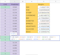
Finally, direct students to apply the “=LOG_REG” function (algorithm) to all feature weights in the 2_Train tab.
(Skip to Step 13 unless teaching high level math)
(Slide 30) This is a good opportunity to point out to students the math that is now embedded in each of these cells. Show them the Logistic Regression formula they have just learned about – before they enter the formula into the weights column in the first cell. (The formula is copied into all the cells).
Step 13: (Slide 31-32) Overfitting. Now that we have our first “guessed” predictions, 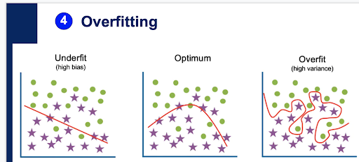 let’s talk about potential issues with our current approach. Before running the Logistic Regression on the scaled 2_Train data, introduce the potential model behaviors. A model can underfit (high bias), overfit (high variance) or be optimum for making predictions based on the dataset. Students will learn through the next part of this activity, why this is important, and how to work with datasets to ensure an optimum prediction from their models.
(Slides 33-35) Go through the example of overfitting for a visualization of what that means in relation to the data points.
Step 14: (Slide 36) Students need to consider that getting new data to test a new model can be challenging and time-consuming – the new data needs to be in the same format as the old data, and there might not be resources to conduct a new study. One way to replicate unseen data is by breaking up one large set of the Framingham dataset into two smaller datasets: one for training the logistic regression model and another for testing the logistic regression model. Creating a model takes a larger training dataset than the test set because it requires much more data to produce a good prediction. For the student activity the training set accounts for 80% of the data (700 participants), and the test set is the remaining 20% (300 participants), broken up in a random fashion with 100 more data points added to reduce any bias that might be in the original dataset.
Step 15: (Slide 37) Your turn. Direct students to follow theLogistic Regression Steps for Activity: (Google Sheets and Excel). View the predictions for your test set data to determine how well your model performed. See the results in the “3_Test” tab. This sheet has automatically used the weights generated from the “2_Train” dataset to make predictions for the “3_Test” dataset.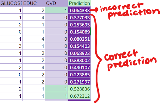
- Review your predictions – comparing the “Predictions” column with the “CVD” outcomes column. Do they match up?
- All predictions of 0.5 or above will be highlighted in green; this represents an outcome of 1.
- All predictions of 0.5 and below will be highlighted in purple; this represents an outcome of 0.
Check in with your partner: What patterns do you observe? Do any predictions surprise you – and why do you think the model outputs those predictions? Mathematically, how is the model making these predictions, and does this model look like it does a good job predicting unseen data? Why or why not?
Step 16: (Slide 38-44) Measuring model accuracy. This section explains how to understand the results of the model in the form of Confusion matrices. 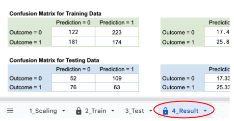 Address the three model measurements of accuracy, precision, and recall. Because we’re using medical data, we specifically want to reduce the number of false negatives therefore, we want to maximize our model’s recall over our precision, since we want to reduce the number of false negatives we see in our predictions. What do you notice about your matrices? Does this change your perception of how well your model predicts? Why or why not?
Step 17: (Slide 45-46) Address the reason we reduce false negatives over false positives and how to adjust the threshold to change those measurements.
Step 18: (Slide 47) Address the issue of underfit and overfit data for our specific dataset. See the visual examples of overfit and underfit. Use the confusion matrices to better see whether our model overfits, underfits, or is a good predictor. If there’s a mismatch – if our model has high training accuracy but low testing accuracy, or low testing accuracy but high training accuracy, our model will either over or underfit the data. Luckily, it looks like our model has similar training and testing accuracy, so no need to worry about that!
Step 19: (Slide 48) Your Turn. Direct students to the 4_Results tabs in their Logistic Regression Dataset Activity Student: (Google Sheet | Excel) Teacher: (Google Sheet | Excel). Adjust the threshold of your model. Try these steps to see how training works:
- Change the threshold of the model by adjusting the cell labeled “threshold” – change the 0.5 (which represents the threshold) to any other number.
- What threshold works best to maximize the recall while maintaining an overall model accuracy of 0.7+ (70%)?
Step 20: (Slide 49-50) Diabetes and Age. Think about our original question: “Why are incidences of CVD increasing in younger people in the last 20 years?” If a feature is controlled we don’t have to worry about it as a variable – because we have a sampling of a wide range of this feature – it will give us results that take this into account.  Controlled variables were AGE and SEX (there is a wide distribution of ages and both sex are represented). DIABETES is not controlled (some people have diabetes some do not, therefore we need to look at it more closely – is it a feature that could be correlated with CVD outcomes?
What is the current trend in diabetes? Look at the trends in the incidence of diabetes in the last 20 years. Does this correlate with the idea that CVD is increasing in young people? What other factors may also be risk factors? How could we measure these to include in a predictive model? Unfortunately stress is not measurable in a way that it can be included in a mathematical model effectively. (There are many many stress related variables which can not be controlled for a study of this kind.)
Step 21: (Slide 51) Final class summary— How can machine learning be used to accurately predict a patient’s risk of developing CVD? First Pair-Share. Respond to these questions in writing, in a lab journal. Then discuss as a class:
- What features contributed to an outcome of heart disease(CVD) the most?
- Did you find your predictions confirmed factors such as Age contributing to this risk?
- Did the predictions from your logistic regression model answer the question “Why are so many young people diagnosed with heart disease?”
So, we did find that not only age, but also many other factors contribute to an outcome of CVD. And a healthy heart requires considering all of the factors we found. Finally, ask students to answer these questions –
- What did they learn through this activity?
- How could a medical professional and / or patient use this information to inform lifestyle & behavioral changes?
Step 22: (Slide 55-57) See how close our predictions came to the Framingham Study. Assign Framingham Study Background and questions as homework or read and answer questions in class as a group (allow enough class time to have students learn and share). This activity helps to check that their work finding correlations and using logistic regression to create, calculate and refine a mathematical model to make predictions can produce results similar to the Framingham health study. (Remind them, the study has been ongoing for decades, and the more data they have, the closer their predictions can come to the outcomes) Open the Framingham website (home, history, research milestones, for researchers) or read the pdf. Give teams of 2-3 students one of the questions to answer, and ask them to prepare to share what they learn with the whole class.
Questions and student responses (example):
- What is the objective of the Framingham Heart Study? The objective is to figure out more about heart disease because so many people were getting it.
- Why is it called the “Framingham” study? What is the significance of this name? The study started in 1948 in Framingham, Massachusetts.
- What is a “longitudinal cohort study”? What is an “epidemiological study”? It was designed to be a longitudinal cohort study (studying with one person over a long time). And the first epidemiological study of a population for non-infectious diseases (eg. passed from person to person like influenza)
- Who are the study participants? Originally started out with 5209 individuals from Framingham, Mass and eventually spread out to three generations. The study included a cross between young and old people.
- What are key terms from the study, and what variables were being measured? Comparing & contrasting before & after study was done, Key variables: smoking, cholesterol, obesity (BMI is body mass index), glucose is sugar (Glucose an indicator of diabetes) is another variable.
- Why is this study important? This study helped lay the foundation for preventative healthcare.,/span>
- What are the significant findings from this study? Hypertension, smoking, high cholesterol are all associated with high rates of heart disease
- Why is the data publicly available? Who can access it? What are the rules for accessing & using the data? Framingham data is available because it was publicly funded. It is accessible by anyone. You have to request access to the dataset and fill out a research proposal that will be approved by the Framingham Research Council. You also must obtain full or expedited IRB/Ethics Committee review and approval to obtain these data.
- Did the predictions from your logistic regression model match the Framingham predictions? Explain a few of the outcomes that surprised you. Why?
- Can we use the predictions to improve health outcomes for individuals? What else do we need to learn?
End of ‘Logistic Regression’ Activity 2.2.2. Next, Activity 2.2.3 will have students evaluating the limitations and biases of the Machine Learning technique.
Activity 2.2.3
How can we make predictions that could lead to healthier outcomes? (50 min.)
Media and dataset links Activity 2.2.3
- Before Class:
Post the student links in your school communication platform for them to download:- Post assessment : Logistic Regression Post Assessment (Link and QR code also in presentation)
-
- Slide Presentation (2.2.2 and 2.2.3):
-
- Materials, Print outs (or digital copy) Activity 2.2.3:
- Exploring Health Inequity Jigsaw activity and articles
- Classroom materials for poster making (markers, poster paper)
- Materials, Print outs (or digital copy) Activity 2.2.3:
Step 1: (Pre-activity Homework Option- Skip if doing in class) Assign each of these readings to groups of 3-4 students for homework prior to the Activity day or begin by giving each group time to read their article. All students in each group will read and annotate their article before coming to class or to begin class.
Step 2: (Slide 53-54) Overview of Sampling Bias. 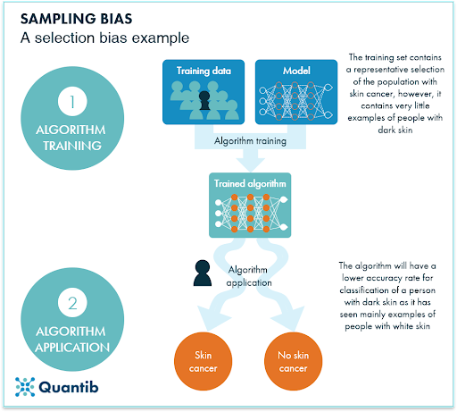 While machine learning and artificial intelligence are some of the most powerful technological tools that we have today, they are far from perfect. There have been multiple instances in recent years where machine learning and artificial intelligence have perpetuated social inequities. Humans naturally hold many biases, and since humans are the ones designing these algorithms (and associated models), we can find bias at every stage of the algorithm design process.
Most machine learning bias comes from how we collect our data. If the sample of data we choose is not diverse, then our model will end up favoring certain groups over others. Doctors have used the Framingham dataset for years to derive clinically relevant predictors of heart health. But because that dataset was mostly comprised of Caucasians, its cardiovascular risk score predictions aren’t as accurate for African Americans. (The broad risk factors can be applied to all races/ethnicities but their exact influence varies from group to group.)
Step 3: (Slide 55) Direct students to open the Exploring Health Inequity Jigsaw activity. If Step 1 was not assigned for homework, assign each of these readings to groups of 3-4 students and give ~10 minutes for students to read their article. All students in each group should read and annotate their article. Once the reading is completed either for homework or in class, give students ~2-3 minutes to share within their group. As a class, have a brief discussion asking each group of students to discuss these questions:
- What did you find interesting? Did anything surprise you about these articles?
- What are the benefits and drawbacks of using artificial intelligence/machine learning in healthcare?
- What needs to be done to ensure that these algorithms are equitable?
- What did you wonder or want to learn more about?
- Now that you understand there can be bias in machine learning, what do you notice and wonder about our machine learning model?
Step 4: (Slide 56) Ask students to answer, with their group: “What tools and techniques can we use to improve health outcomes while making healthcare equitable for all?” Have each group share one idea with the class. Assign groups to research inequities across different groups in the United States using Step 2 of the Exploring Health Inequity Jigsaw activity.
- How can we make health more equitable?
- Groups of 4 research one focus group:
- Asian
- African American/Black
- Latinx/a/o
- LGBTQIA+
- People with disabilities
- Low Income
- Create a poster and a skit to share with the class (~20 minutes):
- Groups of 4 research one focus group:
-
-
- What are the burdens of disease most common in this group?
- What are the two most common causes of health inequity for this group?
- What opportunities are there to achieve optimal health?
- Now that you have explored making healthcare equitable, how could you optimize your machine learning model(s) to improve CVD outcomes for all young people?
-
Share the skit or poster in the last 10 minutes of class.
Step 5: (Slide 57) How is bias being addressed currently? Right now, we definitely see steps being taken in the right direction. Two examples of organizations/groups working to address this issue are the Oxford Commission on AI and Good Governance and the ACM Conference on Fairness, Accountability and Transparency — and there are many more in academic institutions and large corporations around the world.
Step 6: (Slide 58) Have students take the Post-Assessment at the end of these lessons: Logistic Regression Post Assessment
| (Optional: Slide 59) Extension: How else can we use Machine Learning in Biology? Try applying your machine learning skills to make predictions using one of these focus studies*:
(*All datasets are publicly available. For other student project examples go to the “Computational Modeling” module. Ask students: Can you imagine other machine learning applications that you are inspired to explore with your new knowledge and skills? Maybe a global health or an environmental project? Recently two Ambassadors, students working with ISB research scientists, did just that using machine learning to help study algae as a source for biofuel – see: https://isbscience.org/wp-content/uploads/Algaeorithm_AlgaePrize_ResearchProjectPoster.pdf |
This completes the Instructional Activities for this lesson. Please checkout more resources in the Extensions, Career Connection and Assessment tabs above.
Jump to Top
Assessment
How will I know they know? The lesson serves to introduce and prepare students to use machine learning with real world data. They are primarily learning by doing, and most of the learning will come from formative and reflective assessment of the process. Have students take the Pre and Post Assessments at the start and end of the lesson activities.- Correlation Pre Assessment
- Correlation Post Assessment
- Logistic Regression Pre Assessment
- Logistic Regression Post Assessment
Activity 2.2.1 starts with learning about and then using machine learning to find correlations.Activity 2.2.2 introduces the concepts behind the pre-processing of data, and the formulation of algorithms for logistic regression as it is used in machine learning.
- Observing their screenshots of the visualizations and responses to the questions within the step by step guide serves well as a pre-post assessment of learning.
- At the end of each activity asks them to write a personal reflection addressing why their ideas may or may not have changed as a result of their learning.
Activities 2.2.3 is an exploration that asks students to discuss bias and equity in health studies after using the spreadsheet tools to discover correlations and analyze the new information.
- Student contributions and writing about these discussions can provide key insights into their learning as well as highlight the equity in healthcare concepts which are still unclear.
- Another option is to formatively assess student learning in these lessons using your choice of exit ticket format. Suggested questions:
- What did you learn today that surprised you?
- What are you excited to learn more about?
- What questions do you have at this point?
Career Connection
At the end of the Lesson, your students will be ready for a Career Connected Activity (CCA). This activity- highlights a STEM career in bioinformatics, or other data analytics, statistics, and scientific research; and
- is connected specifically to the learning that took place in the lesson.
This activity has been crafted to build directly applied skills (especially for unique STEM careers and pathways), and to build “soft” skills such as 21st Century Learning Skills. Plan how much time you want to devote to this additional content. We offer four options, listed in columns as A-D. You can mix and match the options for each lesson. This means you can have some of these activities take place in class and some out of class (as homework). For every one of these four options, prior to beginning the CCA, first recap what your students learned in the lesson they just completed. This will help them internalize the content of the CCA to improve the positive impact of all of the machine learning activities.
To begin this activity, direct students to use the Labor Market – Washington STEM tool as a resource. Then, depending on how much time you have available, choose one or more of these options:
| A) homework/ outside of class | B) 5-10 minutes in class | C) half of class period
(~25 minutes) |
D) entire class period (~50 minutes) |
| Have students respond to the questions on this handout for homework. | In small groups, brainstorm other careers and workplaces where machine learning would be used. | As a class, brainstorm careers, college majors, and school courses that could be involved with using machine learning. Break into small groups and research one of the brainstorm ideas. Each group will report out to the entire class. | As a class, brainstorm careers that could be involved with using machine learning. In small groups, take on the role of one career. Use this handout to prepare to report out with the entire class. Groups will report out to the entire class. |
Extensions
More about activities embedded within lessons: Choose to flip the classroom by introducing these activities as homework, aligned with the class experience level. (e.g. A more advanced computer science group would need a short review of correlation, but might skip the Card sort, and want to delve into the history of the long-term heart study so they are familiar with the depth and process of conducting health research).- Assign Cardiovascular disease article to read as homework: information about the increase in cardiovascular events in younger people, for more background.
- Reflect: What do you notice or wonder about? What do you think might be some risk factors for cardiovascular disease? Why do you think the disease might be trending younger?
- What are the indicators of healthy hearts? And what steps can researchers and doctors take to monitor and improve the health status of our cardiovascular system?
Machine Learning Card Sorting activity and Instructions Machine Learning Card sort: Adds (50 min.) A group sorting and characterizing activity for students to visually act out the machine learning process, provides a hands-on illustration of machine learning, in advance of the hands-on, excel-based activities.
After the Main Lesson:
| Use these activities with alternative datasets to illustrate other fields in biology and the way machine learning can be used in a broader way.
*All datasets are publicly available. |
| Demonstrate the broad range of uses for machine learning by showing students projects that other high school students have co-created with scientists and educators.
This student-driven project shows how machine learning can work using images as the data source. Two Systems Thinkers in STEM Ambassadors (STISA), students working with ISB research scientists, did just that using machine learning to help study algae as a source for biofuel – see these pages for more information:
Ask students, “Can you imagine other machine learning applications that you are inspired to explore with your new knowledge and skills? Maybe health or a global health project?” We have more student project examples you and your students can peruse – see the links below. Maybe one of your students will be featured on our projects pages in the future! Reach out to us at see@isbscience.org or through our contact page if you have a student project that you think should be featured.
|
Resources
Links, downloadable datasets and presentations:
- Pre-assessment and Post-assessment: (links and QR codes to Google forms are in each presentation)
- Spreadsheet Practice Activity:
- Student: (Google Sheet | Excel)
- Teacher: (Google Sheet | Excel)
- Activity 2.2.1 Correlation
- Dataset Activity:
- Student: (Google Sheets | Excel)
- Teacher: (Google Sheets | Excel)
- Slide Presentation:
- Dataset Activity:
- Activity 2.2.2 Logistic Regression
- Dataset Activity:
- Student: (Google Sheet | Excel)
- Teacher: (Google Sheet | Excel)
- Slide Presentation (2.2.2 and 2.2.3):
- Dataset Activity:
Print outs or digital copies:
- ML Excel / Sheets Cheat Sheet
- Features Key
- Activity 2.2.1 Correlation Steps for Activity: (Google Sheets | Excel)
- Activity 2.2.2 Logistic Regression Steps for Activity: (Google Sheets and Excel)
- [Optional] Print out for teacher: (we highly recommend reading the full lesson plan and doing the activities prior to teaching)
- Here is a copy of the entire module’s teacher guide in a google document. We provided this just in case it is easier for you to read/access. But keep in mind that updates will be made to the webpages, but not necessarily the google file.
- Correlation Presentation Script
- Logistic Regression Presentation Script
- Article: Cardiovascular disease current research information
- Article and Jigsaw: Framingham Study Background and questions
- Jigsaw: Exploring Health Inequity Jigsaw activity
- Bias Articles: AI Bias Articles
- Background: Correlation vs Causation https://www.tylervigen.com/spurious-correlations.
- Reading for homework: What is the difference between Machine Learning and Statistics?